Product Design
APIs & Design System
Leading design system adoption across a growing insurance product ecosystem.
Year :
2018
Industry :
Insurance
Client :
Kinsale Insurance
Project Duration :
1 year

Problem Statement
As the specialty risk insurance ecosystem expanded with new platforms and product lines, design consistency began to fragment. Teams were building in parallel without a shared system, leading to visual inconsistencies, duplicated effort, and misalignment across user experiences.
The absence of a unified design foundation made it difficult to scale efficiently. Interaction patterns, UI components, and visual standards were interpreted differently across teams, increasing maintenance overhead and slowing product evolution.
Without a shared design system to align workflows, components, and documentation, the organization risked operational inefficiencies, brand dilution, and reduced usability across a growing, multi-platform environment.
Approach
Ecosystem Alignment
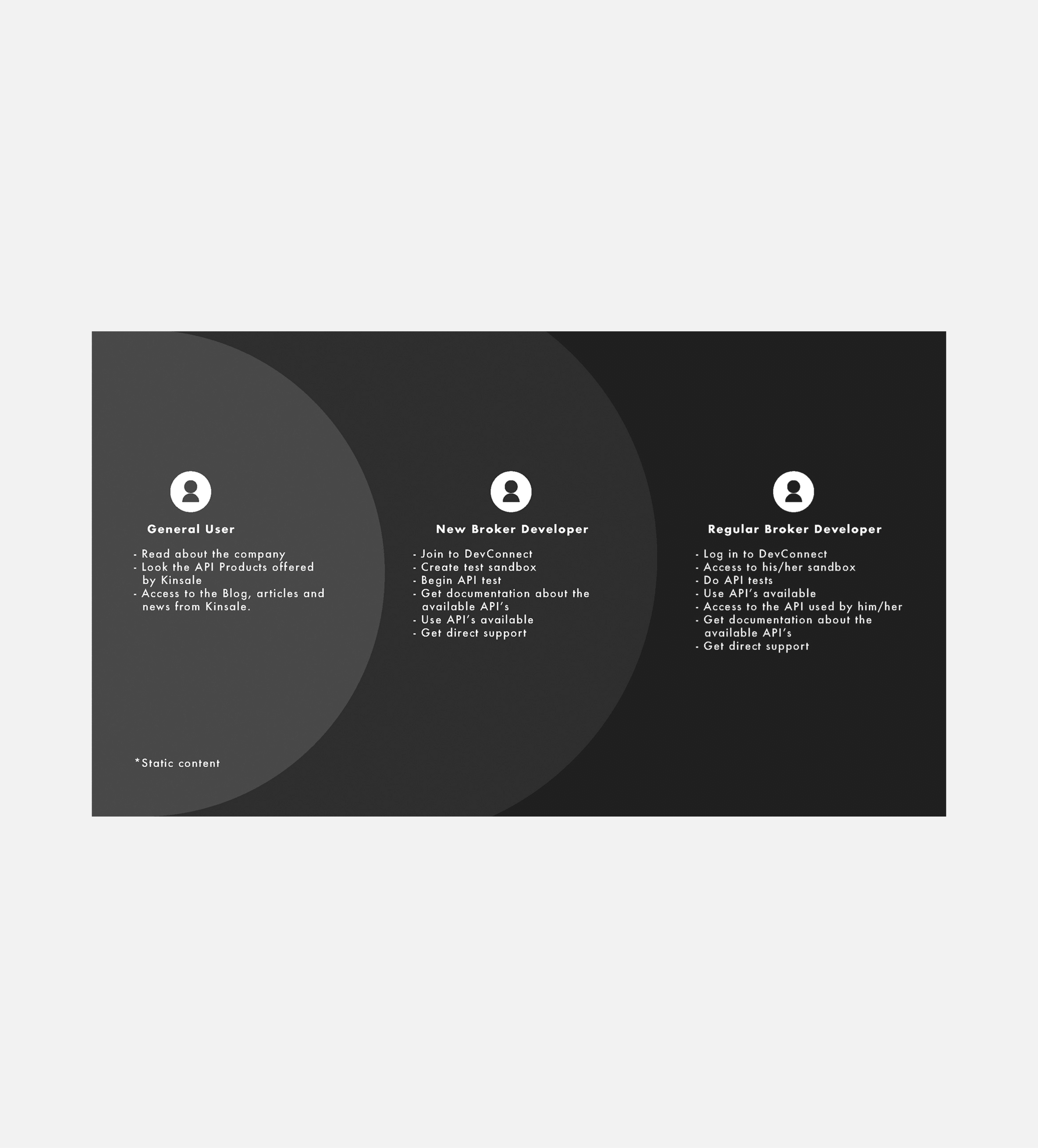
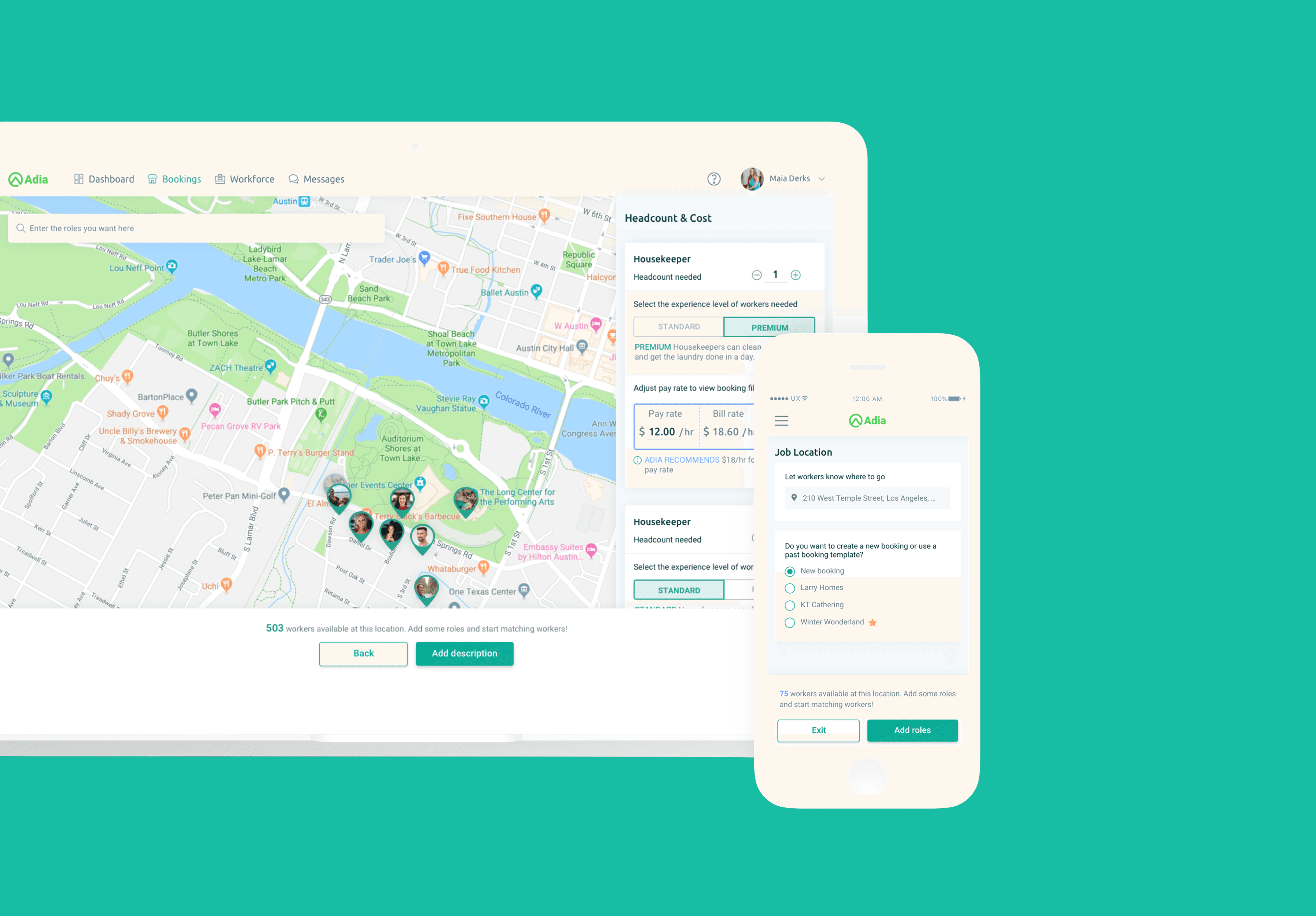
Three insurance products were evolving independently — a developer-facing API platform and two broker-focused platforms for claims and endorsements. Despite serving different audiences, they lacked a shared visual language, consistent interaction patterns, and system governance.
As the ecosystem expanded and additional designers joined, fragmentation became a scalability risk. The approach focused on solving immediate product needs while establishing a unified foundation for long-term growth.
Developer Platform Strategy
Discovery revealed that the primary friction was structural, not visual:
Scattered APIs and documentation
Wide variance in developer experience levels
Five supported coding languages increasing workflow complexity
Efficiency and time-to-integration as core user priorities
The goal became optimizing clarity, speed, and technical usability — not aesthetic refresh.
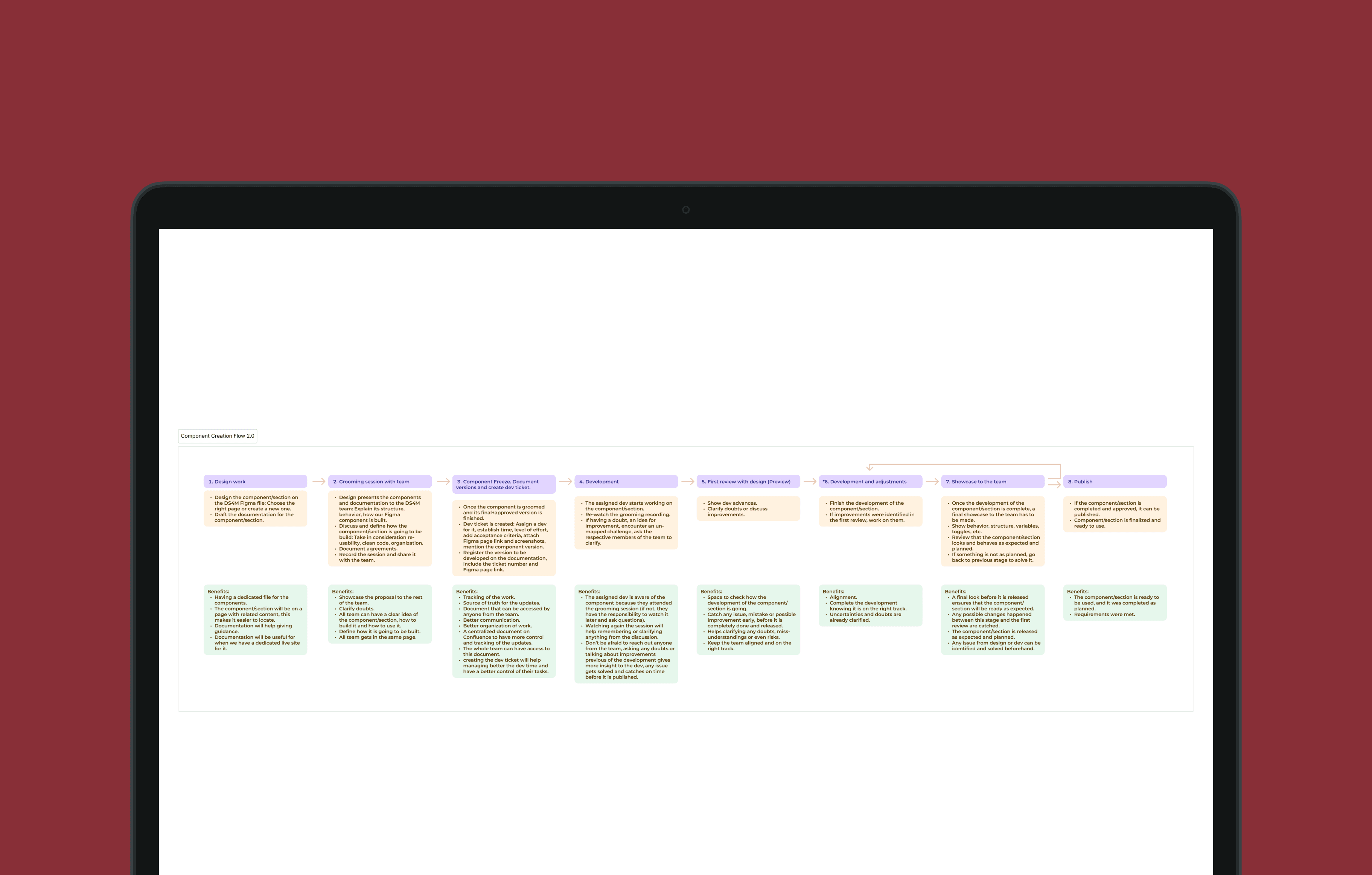
Structured Execution
Each initiative followed a disciplined rhythm:
Requirements alignment with Product
Exploration of multiple solution paths
Early validation through low-fidelity concepts
Continuous feasibility alignment with engineering
This minimized rework and ensured scalability from the outset.
User insights reinforced key requirements:
Dark-mode preference aligned with coding environments
Centralized API resource hub
Cross-language code translation and copy functionality
Desktop-first optimization with responsive support
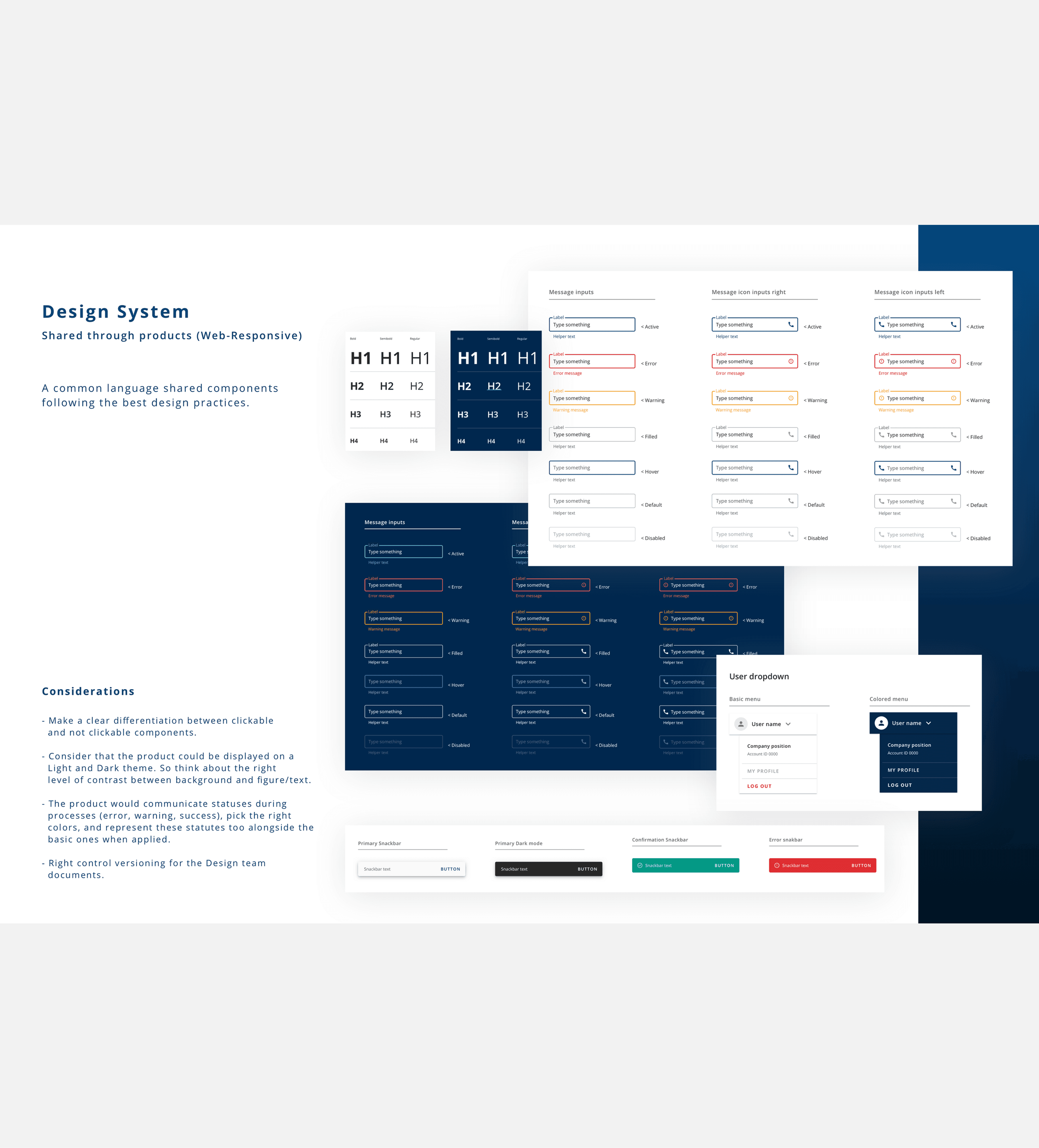
Design System & Governance
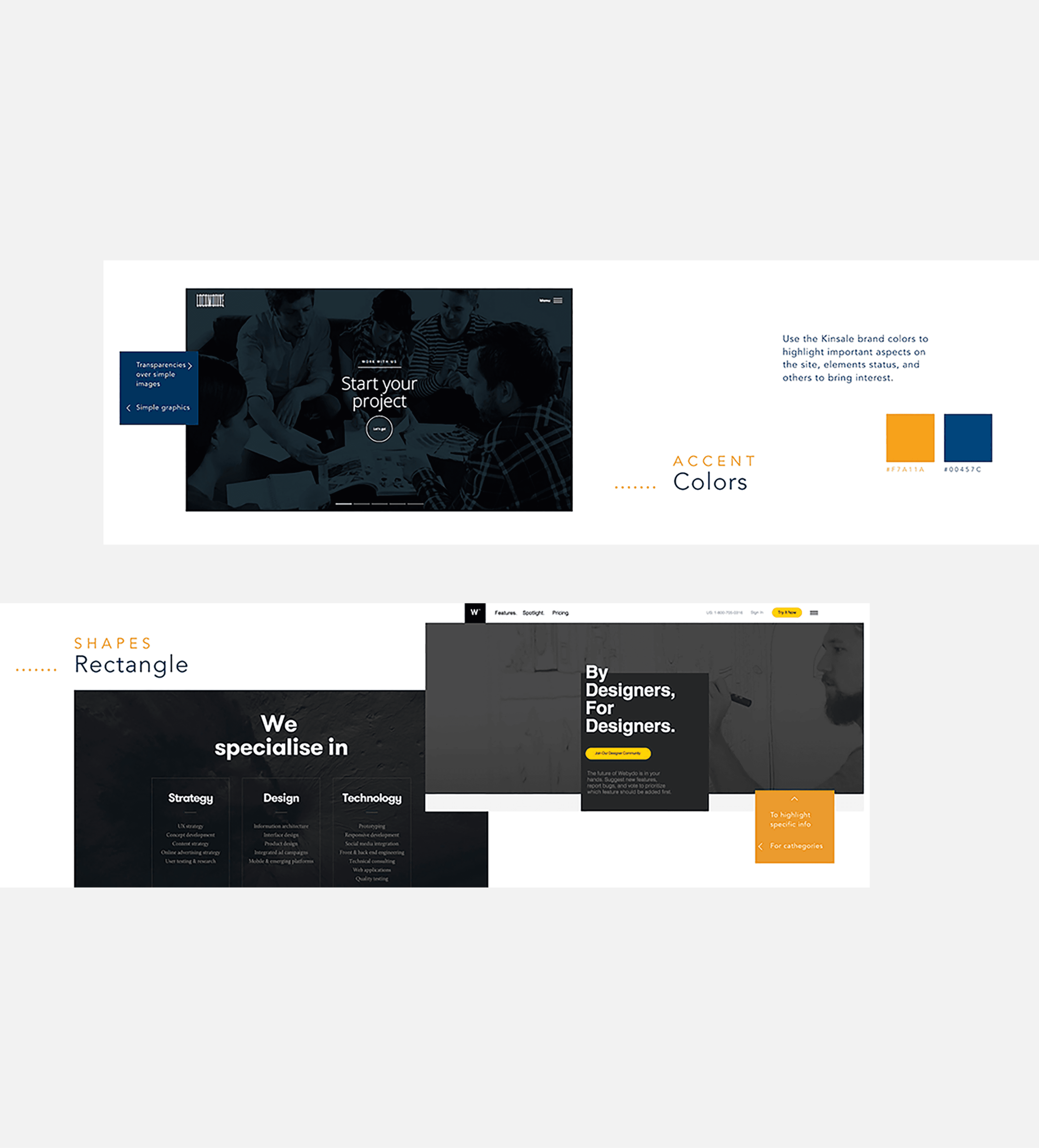
Visual decisions were intentional and systematic:
Shared visual language across products
Reusable components with defined states and behaviors
Structured grid and layout system
Consistent iconography and typography (including code styling)
As complexity increased, I led the creation and partial redesign of a shared Design System — establishing governance, enabling multi-designer collaboration, and unifying the product ecosystem under a scalable framework.
Outcome & Impact
The shared Design System became the cornerstone of the initiative — establishing a unified visual language, reusable component library, and clear implementation standards across the product ecosystem.
Key outcomes included:
Cross-product consistency across three insurance platforms
Reduced design duplication and implementation drift
Improved efficiency for developers through a structured, intuitive API resource experience
Enabled parallel design work without fragmenting the user experience
Strengthened collaboration across design, product, and engineering
Beyond individual features, the system created a scalable foundation capable of supporting new products, additional designers, and evolving regulatory requirements — while preserving brand cohesion and usability.
The initiative shifted design from isolated execution to governed ecosystem strategy — enabling the organization to scale with clarity and confidence.
Lessons Learned
1. Research must scale with the ecosystem.
In multi-product environments, understanding real workflows — from developers to brokers — is critical. Deep insight into how users navigate complexity leads to systems that reduce friction rather than add abstraction.
2. Systems thinking prevents fragmentation.
When products evolve independently, inconsistency compounds quickly. Establishing shared foundations early protects long-term scalability and reduces downstream duplication.
3. Adaptability is part of governance.
Business priorities, regulatory constraints, and technical realities shift. The ability to reassess structure without destabilizing the system is essential in growing ecosystems.
4. Communication sustains alignment at scale.
In cross-product environments, consistent communication between design, product, and engineering is not optional — it’s the mechanism that prevents drift. Early technical collaboration ensures that shared components are both usable and feasible.
Designing across multiple platforms reinforced a core principle: strong product ecosystems are built on shared foundations, not isolated feature wins. Governance, clarity, and intentional system design are what allow teams to scale without sacrificing cohesion.
More Projects


Product Design
APIs & Design System
Leading design system adoption across a growing insurance product ecosystem.
Year :
2018
Industry :
Insurance
Client :
Kinsale Insurance
Project Duration :
1 year
Problem Statement
As the specialty risk insurance ecosystem expanded with new platforms and product lines, design consistency began to fragment. Teams were building in parallel without a shared system, leading to visual inconsistencies, duplicated effort, and misalignment across user experiences.
The absence of a unified design foundation made it difficult to scale efficiently. Interaction patterns, UI components, and visual standards were interpreted differently across teams, increasing maintenance overhead and slowing product evolution.
Without a shared design system to align workflows, components, and documentation, the organization risked operational inefficiencies, brand dilution, and reduced usability across a growing, multi-platform environment.
Approach
Ecosystem Alignment
Three insurance products were evolving independently — a developer-facing API platform and two broker-focused platforms for claims and endorsements. Despite serving different audiences, they lacked a shared visual language, consistent interaction patterns, and system governance.
As the ecosystem expanded and additional designers joined, fragmentation became a scalability risk. The approach focused on solving immediate product needs while establishing a unified foundation for long-term growth.
Developer Platform Strategy
Discovery revealed that the primary friction was structural, not visual:
Scattered APIs and documentation
Wide variance in developer experience levels
Five supported coding languages increasing workflow complexity
Efficiency and time-to-integration as core user priorities
The goal became optimizing clarity, speed, and technical usability — not aesthetic refresh.
Structured Execution
Each initiative followed a disciplined rhythm:
Requirements alignment with Product
Exploration of multiple solution paths
Early validation through low-fidelity concepts
Continuous feasibility alignment with engineering
This minimized rework and ensured scalability from the outset.
User insights reinforced key requirements:
Dark-mode preference aligned with coding environments
Centralized API resource hub
Cross-language code translation and copy functionality
Desktop-first optimization with responsive support
Design System & Governance
Visual decisions were intentional and systematic:
Shared visual language across products
Reusable components with defined states and behaviors
Structured grid and layout system
Consistent iconography and typography (including code styling)
As complexity increased, I led the creation and partial redesign of a shared Design System — establishing governance, enabling multi-designer collaboration, and unifying the product ecosystem under a scalable framework.
Outcome & Impact
The shared Design System became the cornerstone of the initiative — establishing a unified visual language, reusable component library, and clear implementation standards across the product ecosystem.
Key outcomes included:
Cross-product consistency across three insurance platforms
Reduced design duplication and implementation drift
Improved efficiency for developers through a structured, intuitive API resource experience
Enabled parallel design work without fragmenting the user experience
Strengthened collaboration across design, product, and engineering
Beyond individual features, the system created a scalable foundation capable of supporting new products, additional designers, and evolving regulatory requirements — while preserving brand cohesion and usability.
The initiative shifted design from isolated execution to governed ecosystem strategy — enabling the organization to scale with clarity and confidence.
Lessons Learned
1. Research must scale with the ecosystem.
In multi-product environments, understanding real workflows — from developers to brokers — is critical. Deep insight into how users navigate complexity leads to systems that reduce friction rather than add abstraction.
2. Systems thinking prevents fragmentation.
When products evolve independently, inconsistency compounds quickly. Establishing shared foundations early protects long-term scalability and reduces downstream duplication.
3. Adaptability is part of governance.
Business priorities, regulatory constraints, and technical realities shift. The ability to reassess structure without destabilizing the system is essential in growing ecosystems.
4. Communication sustains alignment at scale.
In cross-product environments, consistent communication between design, product, and engineering is not optional — it’s the mechanism that prevents drift. Early technical collaboration ensures that shared components are both usable and feasible.
Designing across multiple platforms reinforced a core principle: strong product ecosystems are built on shared foundations, not isolated feature wins. Governance, clarity, and intentional system design are what allow teams to scale without sacrificing cohesion.
More Projects
Product Design
APIs & Design System
Leading design system adoption across a growing insurance product ecosystem.
Year :
2018
Industry :
Insurance
Client :
Kinsale Insurance
Project Duration :
1 year
Problem Statement
As the specialty risk insurance ecosystem expanded with new platforms and product lines, design consistency began to fragment. Teams were building in parallel without a shared system, leading to visual inconsistencies, duplicated effort, and misalignment across user experiences.
The absence of a unified design foundation made it difficult to scale efficiently. Interaction patterns, UI components, and visual standards were interpreted differently across teams, increasing maintenance overhead and slowing product evolution.
Without a shared design system to align workflows, components, and documentation, the organization risked operational inefficiencies, brand dilution, and reduced usability across a growing, multi-platform environment.
Approach
Ecosystem Alignment
Three insurance products were evolving independently — a developer-facing API platform and two broker-focused platforms for claims and endorsements. Despite serving different audiences, they lacked a shared visual language, consistent interaction patterns, and system governance.
As the ecosystem expanded and additional designers joined, fragmentation became a scalability risk. The approach focused on solving immediate product needs while establishing a unified foundation for long-term growth.
Developer Platform Strategy
Discovery revealed that the primary friction was structural, not visual:
Scattered APIs and documentation
Wide variance in developer experience levels
Five supported coding languages increasing workflow complexity
Efficiency and time-to-integration as core user priorities
The goal became optimizing clarity, speed, and technical usability — not aesthetic refresh.
Structured Execution
Each initiative followed a disciplined rhythm:
Requirements alignment with Product
Exploration of multiple solution paths
Early validation through low-fidelity concepts
Continuous feasibility alignment with engineering
This minimized rework and ensured scalability from the outset.
User insights reinforced key requirements:
Dark-mode preference aligned with coding environments
Centralized API resource hub
Cross-language code translation and copy functionality
Desktop-first optimization with responsive support
Design System & Governance
Visual decisions were intentional and systematic:
Shared visual language across products
Reusable components with defined states and behaviors
Structured grid and layout system
Consistent iconography and typography (including code styling)
As complexity increased, I led the creation and partial redesign of a shared Design System — establishing governance, enabling multi-designer collaboration, and unifying the product ecosystem under a scalable framework.
Outcome & Impact
The shared Design System became the cornerstone of the initiative — establishing a unified visual language, reusable component library, and clear implementation standards across the product ecosystem.
Key outcomes included:
Cross-product consistency across three insurance platforms
Reduced design duplication and implementation drift
Improved efficiency for developers through a structured, intuitive API resource experience
Enabled parallel design work without fragmenting the user experience
Strengthened collaboration across design, product, and engineering
Beyond individual features, the system created a scalable foundation capable of supporting new products, additional designers, and evolving regulatory requirements — while preserving brand cohesion and usability.
The initiative shifted design from isolated execution to governed ecosystem strategy — enabling the organization to scale with clarity and confidence.
Lessons Learned
1. Research must scale with the ecosystem.
In multi-product environments, understanding real workflows — from developers to brokers — is critical. Deep insight into how users navigate complexity leads to systems that reduce friction rather than add abstraction.
2. Systems thinking prevents fragmentation.
When products evolve independently, inconsistency compounds quickly. Establishing shared foundations early protects long-term scalability and reduces downstream duplication.
3. Adaptability is part of governance.
Business priorities, regulatory constraints, and technical realities shift. The ability to reassess structure without destabilizing the system is essential in growing ecosystems.
4. Communication sustains alignment at scale.
In cross-product environments, consistent communication between design, product, and engineering is not optional — it’s the mechanism that prevents drift. Early technical collaboration ensures that shared components are both usable and feasible.
Designing across multiple platforms reinforced a core principle: strong product ecosystems are built on shared foundations, not isolated feature wins. Governance, clarity, and intentional system design are what allow teams to scale without sacrificing cohesion.