Industry
Insurance / Real Estate / B2B SaaS
Client
FA Financial Corp
Financial Corp Features Redesign: Fees

Redesigning a complex fee management experience for clarity, control, and scale.
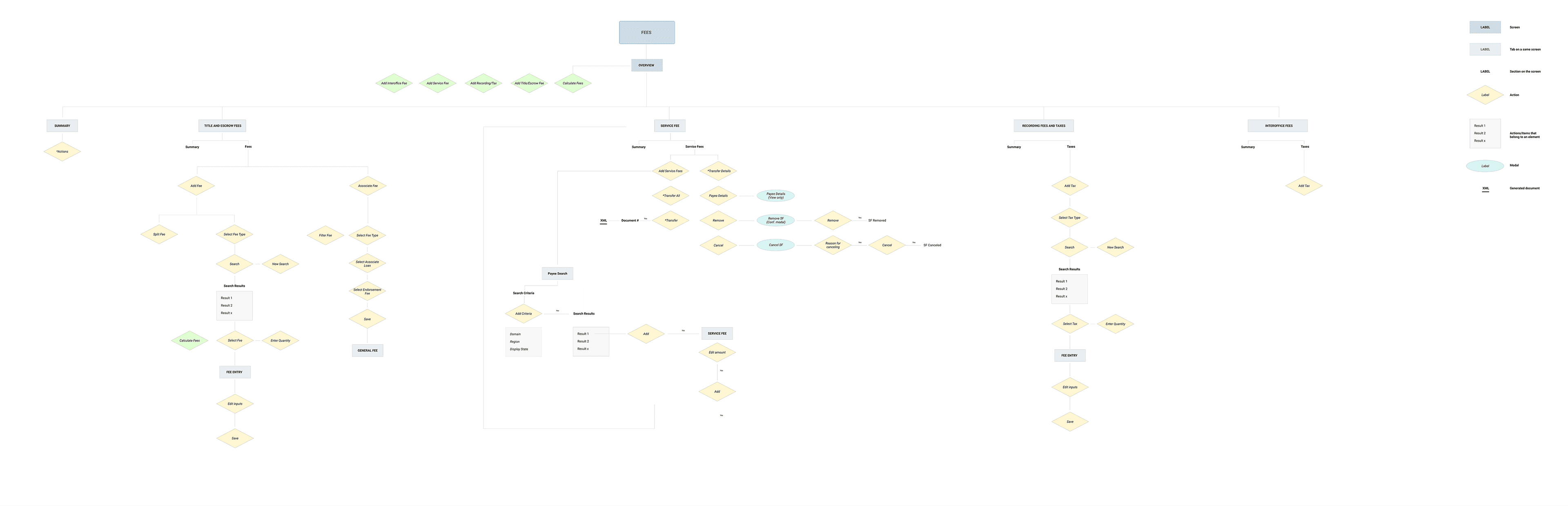
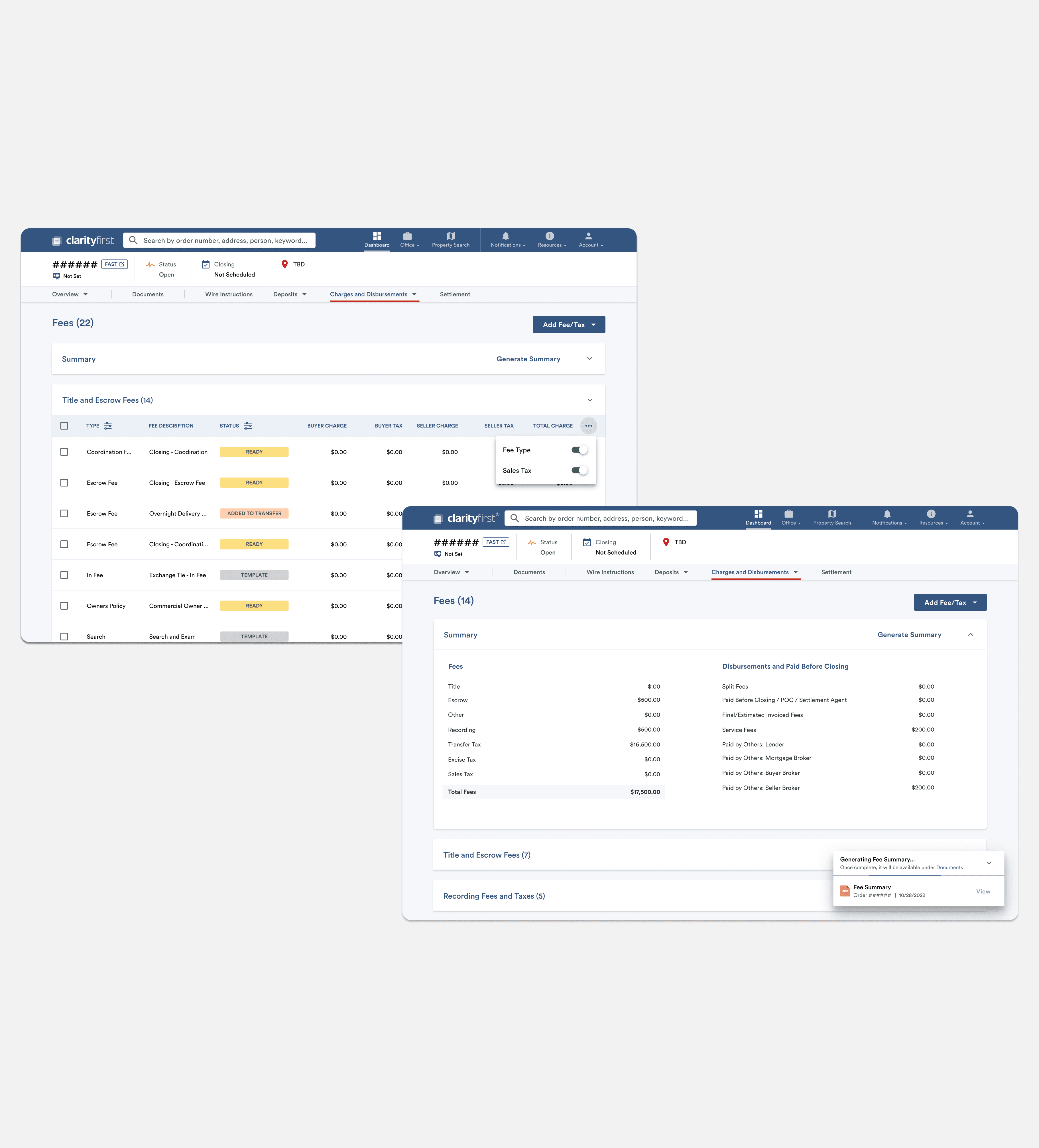
Between 2021 and 2023, I worked at First American across multiple product squads. This case study focuses on the redesign of the Fees feature — one of the platform’s most complex, business-critical tools. The goal was to improve clarity, usability, and efficiency without compromising the flexibility required by different roles, permissions, and U.S. state regulations. As Lead Product Designer, I led the end-to-end redesign, redefining information architecture, designing scalable UI patterns, and aligning closely with product, engineering, and stakeholders to balance usability with real-world constraints.


Process & Outcome
We began by bringing the right people into the same room. During a three-day on-site workshop with Product, Business Analysis, Engineering, and Design, we took a step back to understand the real shape of the problem. Together, we reviewed the legacy Fees experience, defined a realistic MVP and delivery plan, identified technical and legal constraints, and mapped high-level user journeys to ground our decisions in real workflows. Early discovery and user interviews quickly revealed that the challenge wasn’t just a cluttered interface — it was a system that didn’t reflect how people actually worked. Fees fell into four distinct categories, each with its own rules and behaviors. Users were overwhelmed by information they didn’t always need, struggled with inefficient flows for actions like adding, splitting, or transferring fees, and wanted more control over how data was displayed. What initially looked like a single table problem was, in reality, a complex web of tasks, permissions, and state-based rules. With those insights in hand, I worked closely with the PM to rethink the information architecture from the ground up. Instead of forcing everything into one view, we reorganized the experience into four categorized tables, each aligned to a specific type of fee. This allowed us to streamline task-based flows, clarify decision points, and define permission-driven logic so users only saw what was relevant to their role, state, and context. From there, the focus shifted to translating that structure into a scalable, usable interface. We leaned heavily on the existing design system to maintain consistency across the platform, extending it where necessary to support more advanced interactions. New components — such as editable table cells, multi-state modals, and customizable tables — were designed, documented, and built with reuse in mind. Visual clarity, accessibility, and efficiency were core priorities, especially for users managing large volumes of data every day. The redesigned Fees experience brought everything together: a clearer overview with four categorized tables, role-based visibility for sensitive data, and UI customization that allowed users to hide or show columns based on their needs. Core workflows across more than six critical actions were simplified, and subtle accessibility improvements helped make the interface more inclusive and readable. The impact was immediate. Users gained faster, more intuitive ways to manage fees, with less friction and more control. For the product team, the work created a scalable foundation — not just for this feature, but for future growth. The design system evolved alongside the product, enabling faster iteration and more consistent experiences across the platform. This project was a strong reminder that complexity doesn’t have to surface in the experience. True simplicity comes from deeply understanding tasks, aligning design with real usage, and building systems that can grow over time. And, perhaps most importantly, it proved that even the most complex tools — including tables — can be intuitive when designed with care.