Industry
Staffing & Businesses
Client
Adia
Platforms Redesign

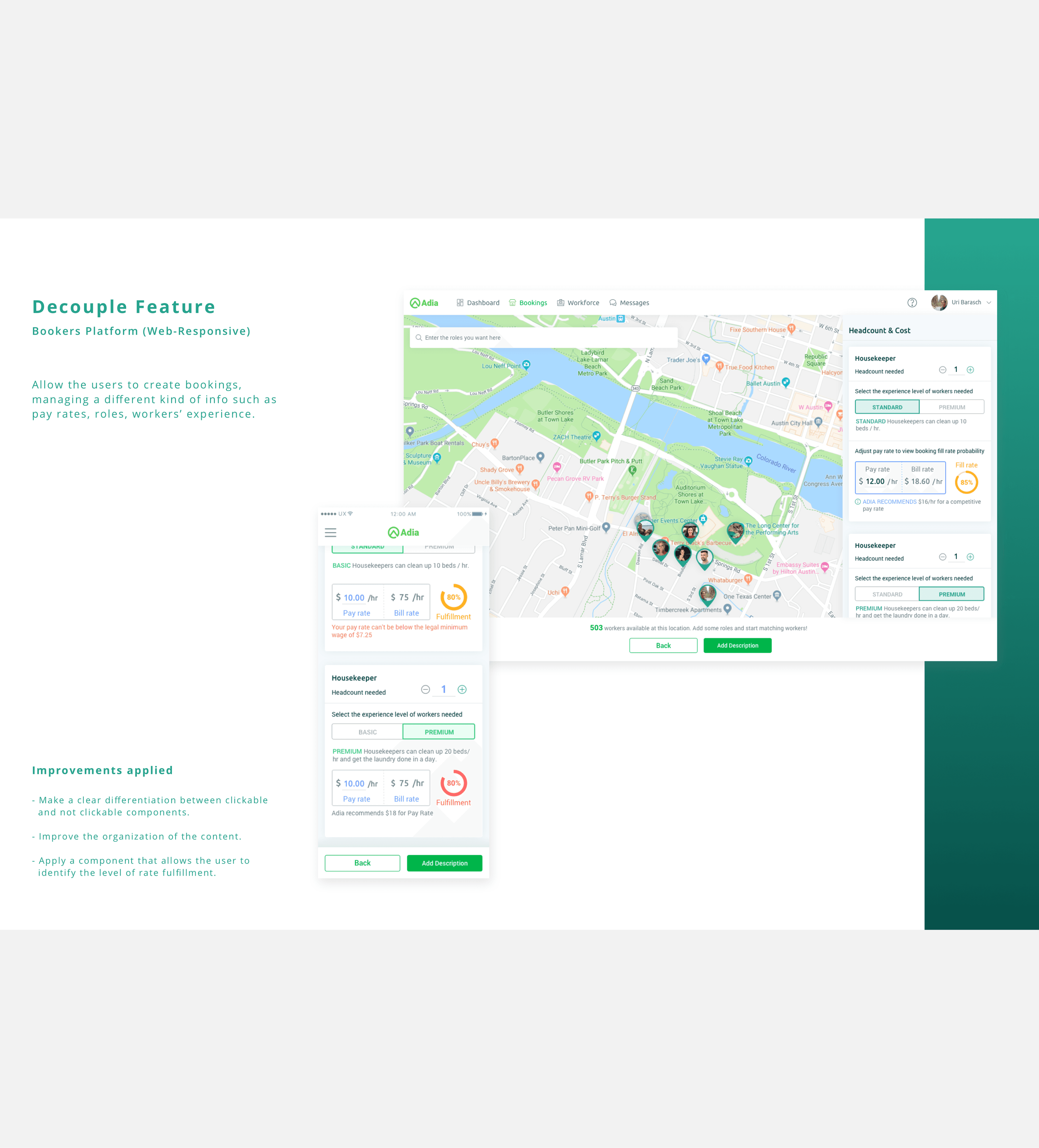
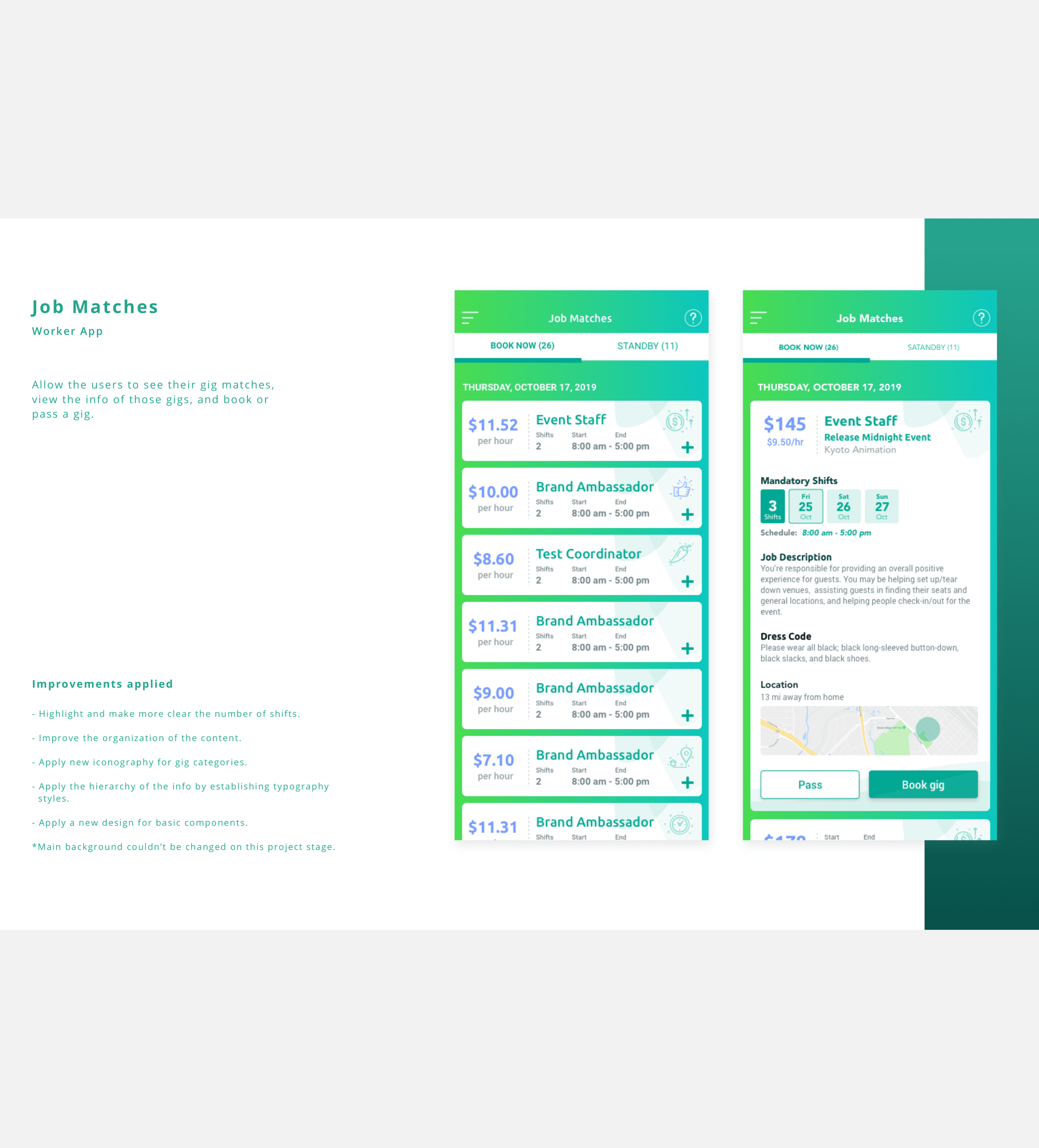
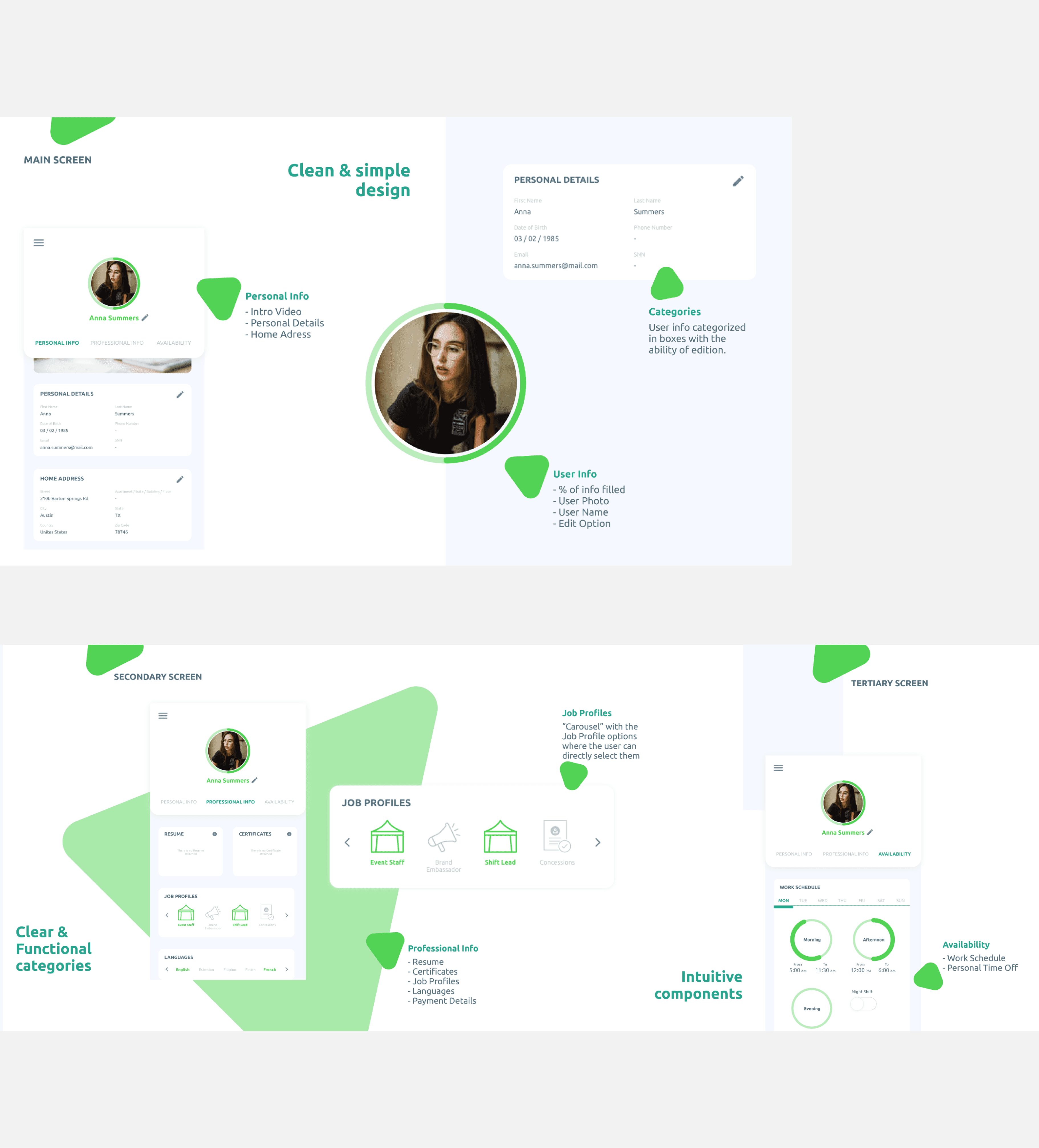
Modernizing a complex staffing experience through gradual UX and UI evolution.
Between 2019 and 2020, I worked on evolving a staffing platform’s look and feel while maintaining stability across a shared component ecosystem. Instead of a full redesign, the focus was on introducing a new visual language gradually to avoid disrupting existing workflows. Working closely with another product designer, I contributed across UI and UX design — including wireframes, mockups, iconography, user flows, and branding support — balancing consistency, usability, and business constraints to deliver a scalable, refreshed experience.
Process & Outcome
This project required a phased approach. We were introducing a new look & feel across three platforms (worker, business, and staffing manager), and we needed to modernize the experience without disrupting shared components or ongoing delivery. I worked feature by feature, adapting the process based on business priorities, scope, and constraints. We followed a structured rhythm: 1. Problem definition For each feature, we clarified what wasn’t working in the current experience (inconsistency, crowded visuals, unclear steps), mapped the user flow, and aligned with Product on the MVP. Personas guided every decision, since each platform served a different role in the staffing process — and the same feature often behaved differently depending on who was using it. Responsiveness was also a constant consideration, from small mobile screens to large desktop monitors. 2. Ideation After aligning on requirements and goals, I benchmarked patterns, brainstormed options, and created low-fidelity wireframes (in Slides) that the Product team could comment on directly. This became a shared thinking space for each user story and helped reduce iteration cycles by catching issues early. 3. Design I moved into high-fidelity mockups, interaction flows, and prototypes where needed, then presented proposals and generated assets for implementation. A key part of this stage was designing for gradual adoption—identifying which shared components could transition first, and which needed to wait until later phases. 4. Visual QA Throughout development, I stayed closely connected with engineering to answer questions, validate edge cases, and review the implementation before demos—ensuring the final UI matched intent and remained consistent across platforms. The work resulted in a cleaner, more structured, and more scalable user experience across the staffing ecosystem. By applying a shared visual language and progressively enhancing common components, we improved consistency while respecting platform-specific needs and constraints. Key improvements included: 1. Clearer flows and UI hierarchy through better labeling, simplified layouts, and stronger information prioritization. 2. A more consistent visual system (colors, typography, spacing, line iconography) across all three platforms. 3. Component behavior defined by status, improving predictability and reducing confusion. 4. Improved readability and accessibility by using contrast and hierarchy (not relying on color alone). 5. Reusable UI patterns (including cards and shared components) that helped lay the groundwork for a more cohesive design system. 6. Better collaboration with engineering through early alignment on technical constraints and continuous QA during implementation. Overall, the platform became more intuitive and efficient for each persona: workers could book and track gigs more easily, businesses could hire more efficiently, and staffing managers had a clearer, more organized process to reduce friction and operational issues like no-shows. - Lessons Learned - 1. Research is essential. Understanding how a product truly works starts with understanding its users. While direct user research wasn’t always possible, leveraging surveys, user feedback, and analytics provided valuable insights that helped ground design decisions in real behavior rather than assumptions. 2. Personas guide better decisions. Well-defined personas were critical across products with different audiences. Each role came with distinct goals, frustrations, and expectations, and keeping those differences front and center helped ensure the experience was relevant, usable, and intentional for every user type. 3. Design with the future in mind. During ideation and execution, thinking one step ahead — particularly around responsiveness and scalability — prevented rework and created solutions that could evolve alongside the product. 4. Adaptability makes a difference. Not everything goes as planned. Being able to adjust, respond proactively, and find solutions within changing constraints proved essential to keeping progress moving and maintaining quality. 5. Clear communication is non-negotiable. Consistent, open communication across design, product, and engineering reduced rework and prevented misalignment. Early and ongoing collaboration with developers was especially important to understand technical constraints and ensure designs were both feasible and effective.